CSS/HTML
Table of contents
General
Try to follow the AirBnB CSS/SASS guideline as far as possible.
Please have a look at the rest of this chapter to see more details about Naming Conventions and BEM (very important!)
Naming conventions
BEM, or “Block-Element-Modifier”, is a naming convention for classes in HTML and CSS.
We will be using BEM for the following reasons:
- It helps create clear, strict relationships between CSS and HTML
- It helps us create reusable, composable components
- It allows for less nesting and lower specificity
- It helps in building scalable stylesheets
Example:
HTML
<a class="btn btn--big btn--orange" href="https://css-tricks.com">
  <span class="btn__price">R199.99</span>
  <span class="btn__text">Subscribe</span>
</a>
CSS
/* Block component */
.btn {}

/* Element that depends upon the block */
.btn__price {}

/* Modifier that changes the style of the block */
.btn--orange {}
.btn--big {}- In this CSS methodology a block is a top-level abstraction of a new component, for example a button:
.btn { }. This block should be thought of as a parent. - Child items, or elements, can be placed inside and these are denoted by two underscores following the name of the block like
.btn__price { }. - Finally, modifiers can manipulate the block so that we can theme or style that particular component without inflicting changes on a completely unrelated module. This is done by appending two hyphens to the name of the block just like
btn--orange.
If another developer wrote this markup, and we weren’t familiar with the CSS, we should still have a good idea of which classes are responsible for what and how they depend on one another. Developers can then build their own components and modify the existing block to their heart’s content. Without writing much CSS, developers are potentially capable of creating many different combinations of buttons simply by changing a class in the markup:

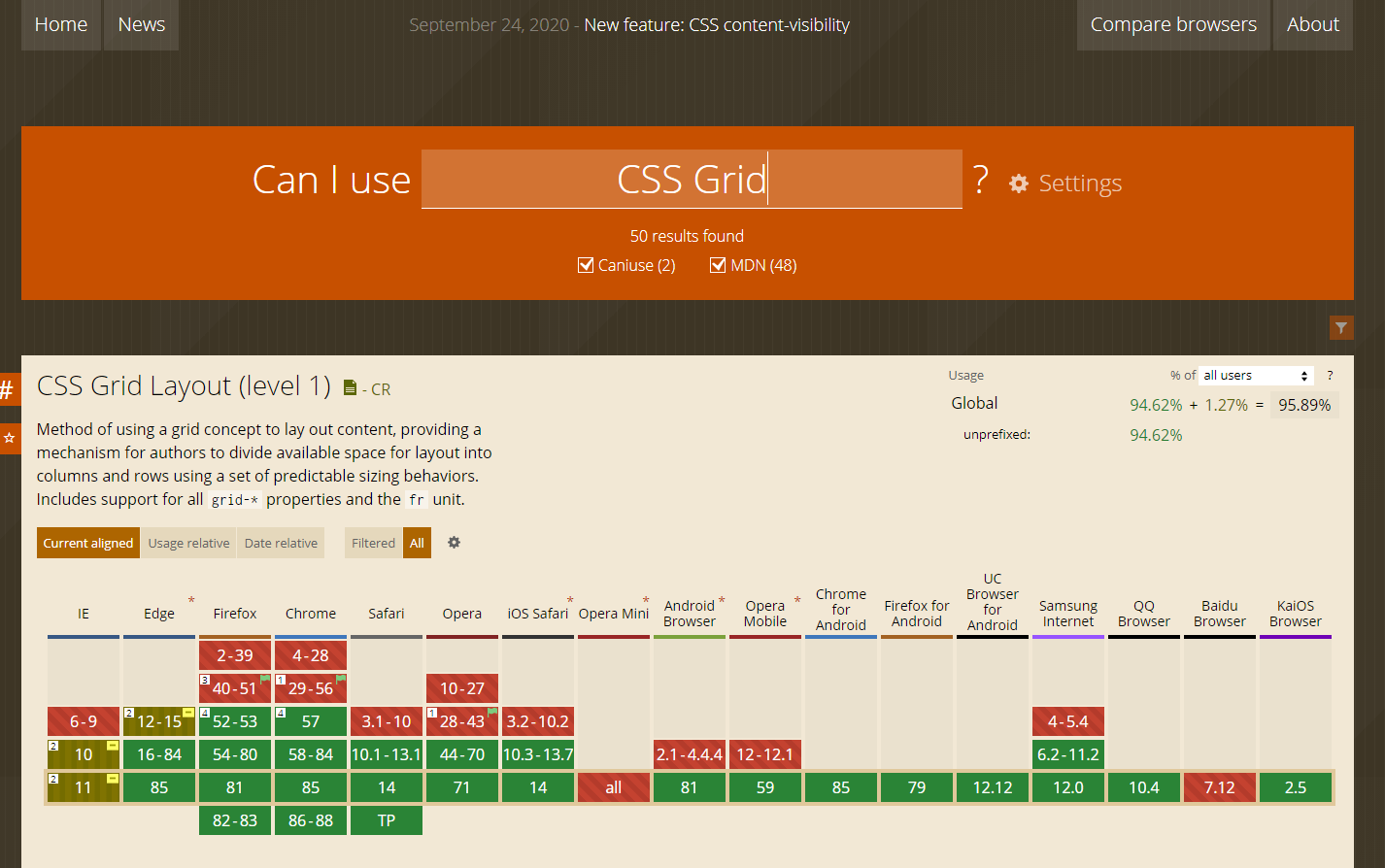
Can I Use
To make sure the supported browsers can render the CSS properties that you want to use, refer to the Can I Use Site.
Can I Use provides browser support tables for modern web technologies.
For example, when searching CSS Grid, you will see all the browsers (and their versions) that can support the properties:
TO DO : show list of browsers supported by Signify
Bundling
Always use bundling to some degree in production. Commonly used CSS files (for an Area or Module) should always be bundled.
TODO : Give more info and examples on CSS bundling
SASS
Sass is a stylesheet language that’s compiled to CSS. It allows you to use variables, nested rules, mixins, functions, and more, all with a fully CSS-compatible syntax. Sass helps keep large stylesheets well-organized and makes it easy to share design within and across projects.
- Click here to view the documentation for SASS
Naming Conventions
Style rules are the foundation of Sass, just like they are for CSS. And they work the same way: you choose which elements to style with a selector, and declare properties that affect how those elements look.
Nested selectors
Do not nest selectors more than three levels deep!
.page-container {
  .content {
    .profile {
      // STOP!
    }
  }
}
When selectors become this long, you're likely writing CSS that is:
- Strongly coupled to the HTML (fragile) —OR—
- Overly specific (powerful) —OR—
- Not reusable
Again: never nest ID selectors!
If you must use an ID selector in the first place (and you should really try not to), they should never be nested. If you find yourself doing this, you need to revisit your markup, or figure out why such strong specificity is needed. If you are writing well formed HTML and CSS, you should never need to do this.
Please refer to SASS Style Rules for more details
Variables
Sass variables are simple: you assign a value to a name that begins with $, and then you can refer to that name instead of the value itself. But despite their simplicity, they're one of the most useful tools Sass brings to the table. Variables make it possible to reduce repetition, do complex math, configure libraries, and much more.
Prefer dash-cased variable names (e.g. $my-variable) over camelCased or snake_cased variable names. It is acceptable to prefix variable names that are intended to be used only within the same file with an underscore (e.g. $_my-variable).
Please refer to the Variables for examples and details
Mixins
Mixins allow you to define styles that can be re-used throughout your stylesheet. They make it easy to avoid using non-semantic classes like .float-left, and to distribute collections of styles in libraries.
Mixins should be used to DRY up your code, add clarity, or abstract complexity--in much the same way as well-named functions. Mixins that accept no arguments can be useful for this, but note that if you are not compressing your payload (e.g. gzip), this may contribute to unnecessary code duplication in the resulting styles.
Please refer to the @mixin and @include for examples and details
Functions
Sass provides many built-in modules which contain useful functions (and the occasional mixin). These modules can be loaded with the @use rule like any user-defined stylesheet, and their functions can be called like any other module member. All built-in module URLs begin with sass: to indicate that they're part of Sass itself.
Please refer to the Functions documentation for examples and details
Ordering of property declarations
1. Property declarations
List all standard property declarations, anything that isn't an @include or a nested selector.
.btn-green {
  background: green;
  font-weight: bold;
  // ...
}
2. @include declarations
Grouping @includes at the end makes it easier to read the entire selector.
.btn-green {
  background: green;
  font-weight: bold;
  @include transition(background 0.5s ease);
  // ...
}
3. Nested selectors
Nested selectors, if necessary, go last, and nothing goes after them. Add whitespace between your rule declarations and nested selectors, as well as between adjacent nested selectors. Apply the same guidelines as above to your nested selectors.
.btn {
  background: green;
  font-weight: bold;
  @include transition(background 0.5s ease);

  .icon {
    margin-right: 10px;
  }
}